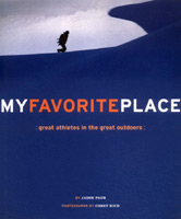
 I saw a fun slideshow by Corey Rich the other night, put on by the American Alpine Club. Corey was in town to promote his new book, My Favorite Place, a collection of photographs and stories about top outdoor athletes. Nice work. Probably because he knew I was going to be there, Corey kindly gave me some credit for helping to launch his career when I was at Rock & Ice, by giving him some creative assignments. That's like saying the bat boy was instrumental in Joe DiMaggio's career—Corey has so much talent that he could have been working for Weekly Plumbing News and he'd quickly have been noticed by New York magazines and ad agencies.
Probably also because he knew I was going to be there, Corey told the story about an expensive and embarassing mistake we made at R&I. One of his assignments was to shoot a series of portraits of climbers just as they topped out on El Capitan after days on the wall. He hauled a bank of batteries and lights up there and set up a little studio on top, and the resulting images were memorable.  One of them, of El Cap free climbers Thomas and Alexander Huber, made the cover, under the banner title "Yosemite Portraits." Except that's not what the cover we printed said. See anything wrong with this picture? We didn't. That cover type must have been read by 15 different people in the production process, from editors to designers to the workers at our printer in Salt Lake City. I personally press-checked that issue, and I OK'd the color proofs as they rolled off the roaring press. I fine-tuned the color but obviously didn't read what I was proofing. After approving the cover, I returned to the customer lounge at Hudson Printing, a cramped room with a phone, a TV with no cable, and a lumpy couch on which I spent too many nights because we couldn't afford a motel, and I called Aaron Gulley, the managing editor at the time. I was chatting with him about the issue and I said the cover looked great and... "Holy shit!" I had just noticed that we had misspelled "Portraits" in 72-point type.
What to do? Reprinting the cover was going to cost about $5,000. That's a lot of eighth-page ads down the drain, I can tell you that. Would anyone even notice? (We didn't, after all.) Yet this issue also would appear at the Outdoor Retailer trade show a few days later. Someone undoubtedly would notice there! And there was the small matter that we had put Corey's byline on the front cover, right by that word "Portaits." Hemming and hawing, I called Corey and asked him what he thought. He was loathe to pass judgment but eventually allowed that, if it were up to him, he'd redo it. That's what Aaron thought. And, in the end, that's what I thought, too. I bit the bullet and ordered the change. And so the "Yosemite Portaits" cover of Rock & Ice is printed here first.
After I got back to Boulder, I decided to have some fun with our freelance proofreader, the climber and skier Andy Moore, who didn't get a chance to see the cover before we went to press. I sure wish he had: We sent him the screwed-up version, and, sure enough, he spotted the mistake and sent back the "proof" with a sticky note that said, "Hey, is this really the cover??? If so, there's a big mistake. (Is it too late to get this changed?)." I keep the "Portaits" cover and Andy's note in my office at home—a reminder to always check my work!

Monday, May 15, 2006
Yosemite Portaits
![]()
![]()
Subscribe to:
Post Comments (Atom)


2 comments:
As a former employee at both book and newspaper publishing companies I can attest to the brains uncanny ability to see what it wants or expects to see. At least you caught it before it was too late. And I can say I haven't noticed any spelling mistakes on this site yet. Nice work.
Thanks for the memory, Dougald. That's funny that you've still got that sticky note. By the way, are you looking for a proofreader for your excellent blog? I noticed a couple of errors above. ;-)
Post a Comment